


Monday morning is usually when the question shows up. The owner of an HVAC shop, dental practice, pest control company, or roofing crew doesn't want another platform login, another export, or another pretty chart. They want to know whether the phones are ringing from the searches they meant to win, especially the transactional searches where somebody types “roofer near me,” “dentist near me,” or “air conditioning repair near me” with intent to buy.
That's where a performance dashboard earns its keep. In modern business intelligence, it works as a centralized, real-time interface that consolidates KPIs from multiple data sources so leaders can monitor performance and make faster decisions corporate dashboard guidance. For local service businesses, that usually means one screen that ties Google Maps visibility, calls, forms, bookings, and city-level search demand back to actual revenue work, not vanity reporting.
Why a Performance Dashboard Matters for Local Service Businesses
An owner can open four different tools and still not know what worked. Google Business Profile shows one slice, Search Console shows another, call tracking shows a third, and the CRM shows what happened after the lead came in. A performance dashboard pulls those pieces into one place so the operator can answer a simple question fast, whether the business is a dental office, a roofing crew, or a pest control route.
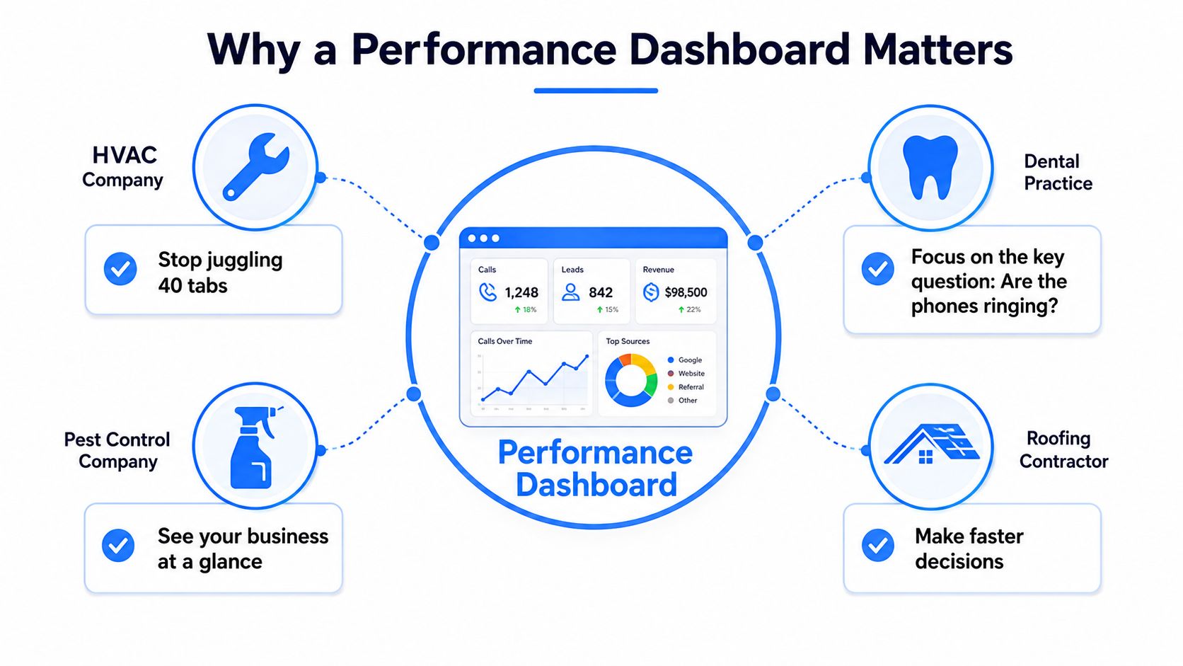
The best versions do not try to show everything. Industry guidance says dashboards work best when they are built around a small set of meaningful metrics, often 5–10 KPIs, and designed for a specific audience rather than everybody at once corporate dashboard guidance. That matters because a local service owner needs a readout they can trust in a minute, not a wall of charts that looks busy and answers nothing.
Harvard's Government Performance Lab also recommends trend data that goes back at least 2 years, with a benchmark or target line and disaggregation by subunits, because a single number rarely tells the whole story Harvard Government Performance Lab. For local operators, that means the dashboard should show whether calls, forms, and bookings are moving in the right direction, not just whether the marketing team made the line go up this week.
Practical rule: if the dashboard does not show whether the marketing produced booked jobs or appointments, it is reporting noise.
A good example is the gap between traffic and booked work. A roofing company may see a healthy rise in website visits from city pages, but if the dashboard also shows flat call volume, weak answer rates, and few booked inspections, the owner can see the problem immediately. That is much more useful than celebrating visits that never turn into a truck roll.
Local operators also need to know whether visibility is turning into contact from the right areas. A dashboard that ties Google Maps rankings, Google Business Profile insights, call tracking, and city-level search demand back to revenue makes that easier to see, especially for businesses that depend on transactional searches and map pack traffic. For a practical framework on that side of the job, how a GMB performance tracking dashboard can improve local search visibility and leads is worth a look.
For service-area businesses, the dashboard is also a reporting tool the owner can read in 60 seconds. That is where context from track local service marketing results helps, because the point is not to admire marketing activity, it is to connect it to calls, bookings, and revenue that show up on the schedule. If the owner can scan one screen and know whether the transactional searches are paying off, the dashboard is doing its job.
The KPIs That Actually Drive Local Service Revenue
Most KPI lists are written for software companies or online stores. Local service businesses need a different lens, because a roofer doesn't care about bounce rate nearly as much as they care about calls from the right zip codes. The best dashboard starts with transactional search intent, then traces the path from visibility to contact to booked job.
Start With Search Demand and Map Visibility
The first layer is the visibility that creates the opportunity. Google Maps rankings for transactional terms matter because they put the business in front of people who are already ready to buy, and local companies should watch those rankings by service city and by service line. Search Console impressions and clicks for service-area queries also belong here, because they show whether the business is surfacing for the exact terms people are typing into Google.
A useful dashboard separates leading indicators from lagging indicators. Map rank and impressions are leading indicators, while calls, forms, and appointments are lagging indicators. That split prevents a team from celebrating visibility that never becomes revenue.
Track Contact Quality, Not Just Contact Count
Calls, direction requests, form submissions, and booked appointments are the key business metrics. A phone call that lasts long enough to become a scheduling conversation means something different from a 10-second accidental dial. Raw call volume can look impressive, but it only matters when paired with answer rate, duration, and the outcome in the CRM or scheduling tool.
A dashboard should tell the owner whether a lead was worth answering, not just whether a lead existed.
For paid campaigns, cost per lead belongs on the page because it shows how much the business is paying to create a contact. If the dashboard can't compare lead cost against booked appointments, the operator is guessing. The same applies to organic sessions landing on city and service pages, because those sessions are only valuable when they support calls, forms, or bookings.
Transactional Marketing also offers an internal way to frame this around acquisition math, and the company's explanation of how to calculate cost per acquisition fits well with this KPI set. The point isn't to overload the owner with metrics. It's to keep the dashboard close to the money.
Connecting Your Data Sources Without Drowning in Tabs
A dashboard is only as honest as the data feeding it. If the inputs are messy, delayed, or duplicated, the screen can look polished while still giving bad guidance. The cleanest builds for local service firms start with the data they already own, then connect each source to a specific question.
Pull the Right Field From Each System
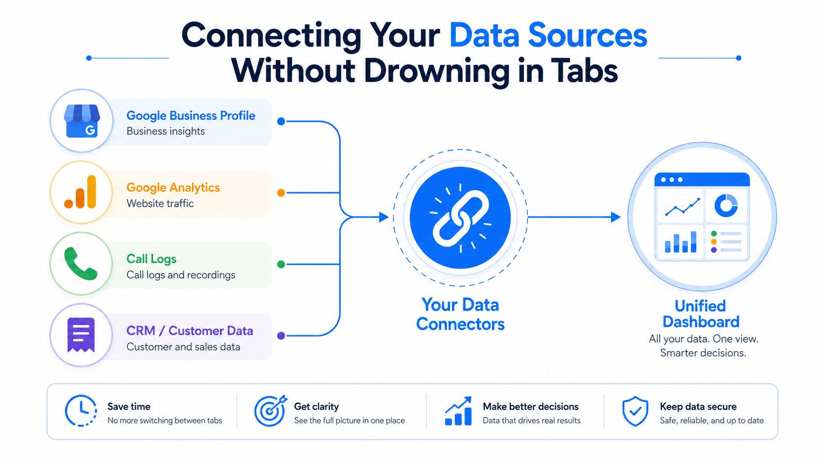
Google Business Profile is where many owners should begin, because the profile is tied to calls, direction requests, and profile interactions. Google Search Console is the best place to spot the transactional terms you already rank for, especially the service-plus-location queries that reveal demand. Google Analytics 4 helps confirm which city and service pages are attracting visitors, but it should never be the only source of truth.
Call tracking platforms are useful when they capture answer rate, duration, and source. CRM or scheduling software matters because it shows whether the lead became a booked appointment or a lost opportunity. Review platforms can add context, but they shouldn't dominate the dashboard unless reputation is the core issue.
Check Readiness Before You Connect Anything
The biggest mistake is wiring five tools together before confirming that the names, service areas, and lead sources are consistent. If a call tracking platform labels a lead one way, the CRM labels it another way, and the Google Business Profile uses a third naming convention, the dashboard becomes harder to trust. API limits and refresh cadence matter too, because some sources update on a schedule rather than in real time.
A good operator checks three things before launch.
- Source consistency: Make sure service names, city names, and campaign names match across tools.
- Refresh timing: Confirm whether the data updates in real time or on a schedule so the dashboard doesn't mislead the owner.
- Field relevance: Ignore the extra fields that don't help answer the business question, because clutter slows the build.
That approach aligns with the five-phase methodology used in high-value dashboard work, which starts by validating metrics against audience needs and ends by planning for action Info-Tech dashboard methodology. For a practical look at how local search teams organize reporting, local SEO reporting tools is a useful companion reference. The goal is simple, fewer tabs, more confidence, and a cleaner path from data source to decision.
Choosing the Right Build Option for Your Business
A 1 to 10 location service business doesn't need an enterprise BI program. It needs a build that matches the team's patience, the reporting cadence, and the owner's appetite for maintenance. The right choice depends on whether the dashboard is something the owner wants to live in, or something they want sent to them.
Spreadsheet, BI Tool, or Embedded Portal
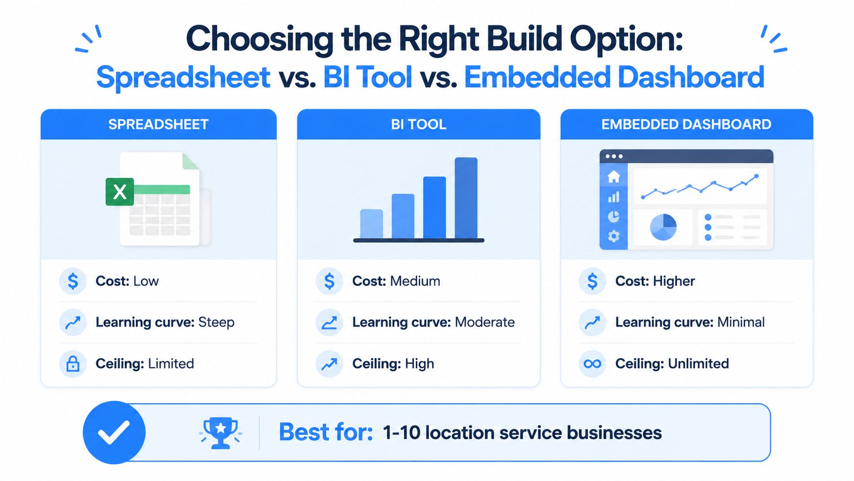
A spreadsheet build works for owners who want control and don't mind manual cleanup. Google Sheets can be enough for a tight dashboard if the data set is small and the team is disciplined, but it gets brittle when more locations, more service lines, or more sources get added. Looker Studio is often the next step because it gives better visuals and easier sharing without pushing the business into a heavy BI stack.
Power BI and Tableau make sense when the operator wants cleaner visuals, better interactivity, and more automation, especially if multiple managers need to use the same view. An embedded dashboard inside an SEO partner portal fits the owner who wants reporting delivered on a schedule rather than logged into on demand. Transactional LLC, for example, positions a transparent results dashboard around keyword timelines by service city, map ranking heat maps, Search Console queries, and traffic, with biweekly reporting as part of the service.
Match the Tool to the Team
| Option | Best For | Cost | Maintenance |
|---|---|---|---|
| Spreadsheet | Hands-on owner, very small team | Low | Highest manual upkeep |
| BI tool | Operator who wants automation and better visuals | Medium | Moderate ongoing setup |
| Embedded dashboard | Owner who wants reporting handed to them | Higher | Lower day-to-day burden |
The decision rule is straightforward. If the owner wants to edit formulas and watch every detail, a spreadsheet is fine. If the team wants a cleaner system with more flexible visuals, a BI tool is the better middle ground. If the owner mainly wants a dependable readout without managing the build, an embedded dashboard is easier to live with.
The right build is the one someone will use every week, not the one that looks smartest in a demo. For a local service business, that usually matters more than software prestige.
Building Your First Performance Dashboard Step by Step
A good first build starts with one business question, not a pile of metrics. For a roofer, that question might be whether transactional searches are turning into booked inspections. For a dental practice, it might be whether the office is getting enough new patient calls from the right neighborhoods.
Build the metric set before the layout
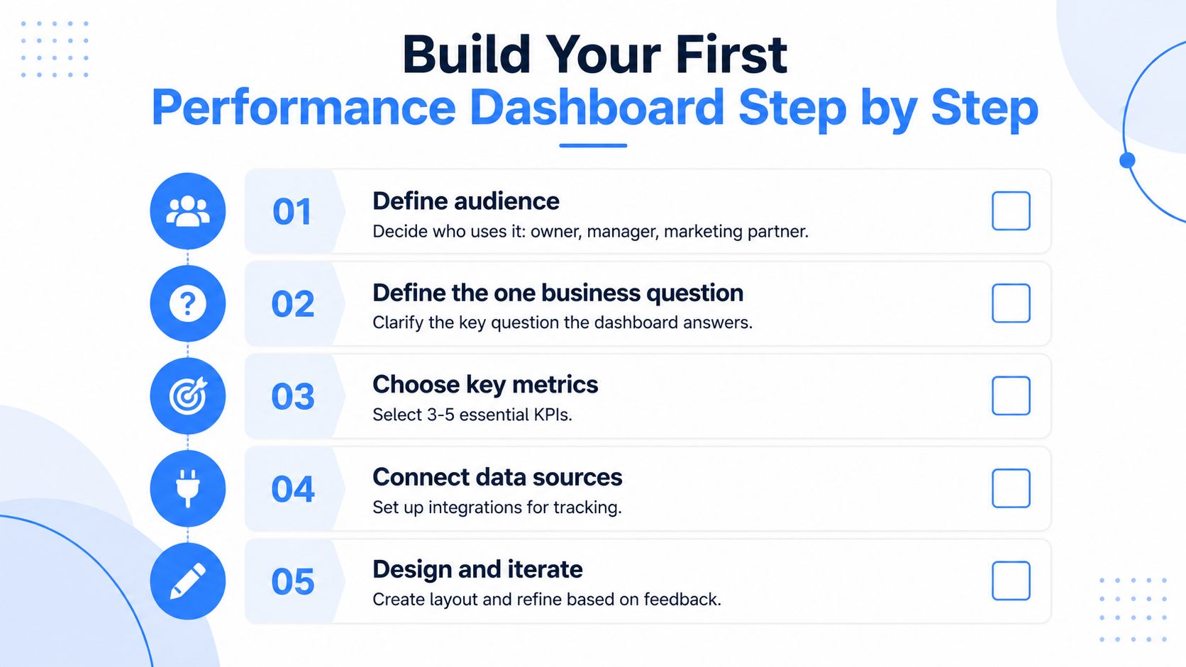
The first step is audience and purpose. The owner, office manager, and marketing partner don't all need the same view, so the dashboard should be designed for one primary user first. After that, define the KPI set and keep it tight, because dashboards built around a small set of meaningful metrics are easier to read and act on corporate dashboard guidance.
Next comes ownership. Info-Tech recommends documenting why each KPI matters, who owns it, and what action gets triggered when it moves out of range Info-Tech dashboard methodology. That simple discipline keeps the dashboard from becoming a passive report.
A practical build sequence looks like this.
- Define the question. Decide what decision the dashboard must support.
- List the KPIs. Keep the set focused on the metrics that affect calls, appointments, and booked jobs.
- Connect sources one by one. Verify each feed before adding the next one.
- Lay out the screen. Put the top-line result up top, then show supporting drill-downs below.
- Test before rollout. Run it for a short pilot and fix the items that confuse the owner.
Use filters and drill-downs that a contractor would actually use
Filters by city and service line matter more than fancy chart types. A multi-location pest control operator needs to know which branch is underperforming. A dental practice may need to split emergency, cosmetic, and hygiene demand. The dashboard should let the owner move from the big picture to the exact service area without opening a second system.
If the owner needs training just to find the city filter, the build is too complicated.
Before anyone outside the build team sees it, check that each KPI has a source, a refresh cadence, a clear threshold, and a real action tied to it. That's the point where a reporting screen becomes a management tool.
Visualization and Storytelling Choices That Actually Help Owners Decide
A dashboard can have perfect data and still fail if the layout hides the answer. Most service-business owners don't need a wall of gauges. They need a screen that tells them, quickly, whether the right searches are producing the right actions.
A strong pattern is to connect leading indicators to lagging results in the same view. For example, map rank and Search Console impressions can sit near calls, forms, and booked appointments so the owner can see whether visibility is turning into demand. That pairing matters because activity metrics on their own can look busy without proving business value.
For dashboard design ideas, 925 studios on dashboard design trends is a useful reference point, especially if you're trying to understand how modern reporting screens keep the focus tight. The lesson that matters most for local services is simple. A single trend line with a target is easier to read than a stack of gauges, and a heat map of map rankings by city can be worth the build when geography drives revenue.
Keep the owner on the main path
The most useful dashboards answer three questions in order. What happened? Where did it happen? What should we do next? The layout should support that flow with a top-line number, a supporting trend, and then drill-downs for city, service line, and source.
A few design choices make a big difference:
- Place the headline metric first: The owner should see the main outcome before anything else.
- Use drill-downs sparingly: Too many branches turn the screen into a maze.
- Hide decoration: Extra colors, dense labels, and novelty charts make the report harder to read.
The cleanest dashboards don't reward browsing, they reward action. If a service-area manager can open the view, scan it in 60 seconds, and know whether to call, adjust, or hold, the design is doing real work.
Maintaining the Dashboard and Running the Reporting Cadence
A dashboard starts decaying the moment nobody checks the inputs. A source changes its naming convention, a call tracking number is swapped, or a city filter goes stale, and the report becomes less trustworthy. The fix is a cadence that keeps the dashboard aligned with how the business operates.
For most local service teams, the rhythm is simple. The operator glances at the screen daily, the marketing partner reviews it weekly, the owner gets a biweekly summary, and the KPI set gets reviewed monthly or quarterly depending on how fast the business changes. That rhythm fits the way transactional search work behaves, because the goal is staying visible for the terms that bring in ready-to-buy customers.
The biweekly report should pull the dashboard into a one-page summary that highlights wins, misses, and what changed. If the owner needs a partner to package that report, client SEO reporting is the kind of workflow that keeps the conversation focused on action instead of screenshots.
Watch for the warning signs
The dashboard is overdue for cleanup when it starts showing numbers nobody discusses, metrics with no owner, or charts that never change behavior. It also needs attention when the metrics drift away from the transactional terms the business wants to own. If “roofer near me” and similar high-intent phrases aren't still at the center of the report, the dashboard has lost its direction.
A healthy cadence ties reporting back to the SEO roadmap. Search terms, map rankings, calls, and booked work should keep informing the next round of content, local pages, and Google Maps optimization. That loop is what keeps the business pointed at demand instead of vanity.
Transactional LLC builds local SEO systems for service businesses that need to show up for transactional search terms, strengthen Google Maps visibility, and see the numbers in a dashboard they can use. If you want a reporting setup that ties local search, map rankings, and booked-lead activity into one practical view, visit Transactional LLC and see how that framework fits your business.