
You can rank for “roofer near me” or “dentist near me” and still lose the lead in under ten seconds. The visitor clicks. Your page loads slowly. The phone number is hard to spot. The form asks for too much. They hit back and call the next business.
That gap between visibility and action is where user experience optimization matters. For local service companies, it isn't a design trend. It's the difference between traffic that looks good in a report and booked jobs that show up on your calendar.
Transactional search terms matter because they come from people ready to act. If someone searches for a local roofer, emergency plumber, dentist, chiropractor, or med spa near them, they usually don't want to research for an hour. They want a fast answer, a clear next step, and enough trust to call.
Why Transactional Searches Demand a Better User Experience
A homeowner searching for roof repair after a storm doesn't care how clever your homepage looks. They care whether your site helps them solve a problem quickly. The same goes for a parent looking for a pediatric dentist, or someone trying to book an urgent HVAC repair on a hot day.
That's why user experience optimization matters so much for local SEO. Showing up for transactional search terms gets you the click. A clean path to a call or appointment gets you paid. If your website creates friction after the click, your rankings won't save you.
Urgent searches come with zero patience
Transactional searches are different from general research queries. The visitor often has immediate intent, limited time, and low tolerance for confusion. They're usually on a phone. They may be distracted, stressed, or comparing three businesses at once.
A strong local site respects that reality. It gives the visitor what they need right away:
- A visible phone number that doesn't require scrolling or hunting
- A clear service match so they know they landed on the right page
- A location signal that confirms you serve their city or neighborhood
- A simple path to book without long forms or unnecessary steps
If your team is adding online scheduling, it helps to review a practical resource on how to build a booking app so the booking flow supports fast appointments instead of becoming another obstacle.
Better UX has a direct business case
The business case isn't vague. A widely cited benchmark says every $1 invested in UX design can return about $100, which equals a 9,900% ROI, and businesses that prioritize UX can see 1.5x faster growth, while stronger UI and UX can raise conversion rates by 200% to 400% according to this UX statistics summary from Tenet.
That matters for any service business chasing high-intent local traffic. When Transactional Marketing focuses on transactional search terms, the work can't stop at rankings. It has to continue through the click, the landing page, and the contact moment. Otherwise, you're paying to attract buyers and then making it hard for them to buy.
Practical rule: If a new visitor can't tell what you do, where you work, and how to contact you almost immediately, your website is leaking leads.
Many owners also confuse high traffic with qualified traffic. Those are not the same thing. A page can bring visits and still fail if it doesn't convert people searching with money in hand. Understanding what search queries mean for intent and lead quality helps you separate useful traffic from vanity traffic.
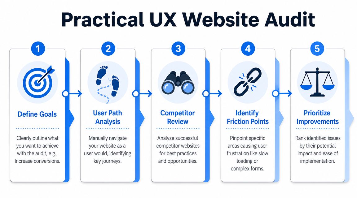
Conducting a Practical UX Audit for Your Service Website
Most local businesses don't need a giant redesign to improve UX. They need a blunt audit that reveals where real customers get stuck. Start with your phone, not your office computer. Search the way a customer would search, then try to complete the most important task.
For a roofer, that task is usually calling for an estimate. For a dentist, it may be booking an appointment. For a pest control company, it might be requesting a same-day inspection. The audit starts with one question: How easy is it for a new visitor to finish that task?
Run the search like a real customer
Use a common local keyword such as “roofer near me” or “AC repair in [city].” Then follow your own result from search to site as if you've never seen it before.
Check these points in order:
Landing clarity
Does the page immediately confirm the service and city? If the headline is generic, visitors hesitate.Call visibility
Can you find the phone number fast on mobile? If it's buried in the menu or footer, that's friction.Action path
Is there one obvious next step, call, form, or booking? Too many options can slow people down.Trust scan
Do you see reviews, service details, photos, or proof you're a legitimate local business?Form burden
If you test the form, how much work does it ask for before someone can reach you?
Use simple UX metrics, not jargon
Usability engineering became formalized in the late 1980s and early 1990s, moving the field toward measurable outcomes such as task success, error reduction, and time on task. Modern KPIs like session duration, user flow, and interaction rate grew out of that evidence-based approach, as outlined in FullSession's overview of user experience optimization.
For a local service site, that translates into plain-language checks.
| What to measure | What to ask on your site |
|---|---|
| Task success | Could the visitor complete the main action? |
| Time on task | How long did it take to find the number or form? |
| Error reduction | Did anything break, confuse, or mislead them? |
| User flow | Did they move naturally toward contact, or wander? |
You don't need formal lab testing to spot big issues. Open your site on an iPhone and an Android phone. Ask someone who doesn't know your business to find your number and request service. Watch where they pause. That pause is often the problem.
A customer never says, “Your time-on-task metric is weak.” They say, “I couldn't find your number, so I called someone else.”
Review competitor paths, not just competitor looks
Many business owners compare colors, logos, and layout. That's the wrong comparison. Study the path instead. Which competitor makes it easiest to go from landing to contact?
Look for things your competitors do well:
- Service-specific pages that match the search term closely
- Short mobile forms with only essential fields
- Sticky call buttons that stay visible while scrolling
- Location cues such as city names, map references, and local proof
If you're working on the conversion side of the site at the same time, this guide on how to improve website conversion rate fits well with a UX audit because it helps you connect friction points to lead loss.
Fixing Common UX Issues That Kill Local Conversions
The biggest UX problems on local service websites usually aren't subtle. They're obvious once you look at the site on a phone with the urgency of a real customer. Three issues show up again and again: slow pages, weak mobile usability, and contact friction.

Guidance highlighted for 2026 says local service UX should prioritize accessibility and low-friction mobile journeys, especially when users are in urgent situations. That same guidance points to WCAG 2.2, plus tools like heatmaps, session replay, and AI-assisted diagnosis for patterns such as dead clicks and rage taps in UXCam's article on UX optimization.
Slow pages lose impatient buyers
A slow site creates doubt before the visitor even reads your offer. If a plumbing page takes too long to appear on mobile data, many people won't wait. They'll bounce and tap another result.
Common fixes are practical:
- Compress oversized images before uploading them. Tools like TinyPNG, Squoosh, and built-in export settings in Canva or Photoshop help.
- Remove clutter plugins that add sliders, popups, or scripts you don't need.
- Use lighter page layouts instead of stacking animations, videos, and giant image banners above the fold.
- Test with PageSpeed Insights to identify heavy elements and mobile bottlenecks.
A good rule for service pages is simple. The visitor should see the service, location, and call button without waiting through decorative nonsense.
Mobile design has to support stress, not just fit a screen
A mobile-friendly site isn't just a shrunken desktop page. It should be built for thumbs, distractions, glare, and urgency. If someone is standing in a leaking kitchen or sitting in a parking lot trying to book a dentist, they need a fast and forgiving interface.
Focus on these fixes:
- Keep tap targets large so users can hit buttons without zooming.
- Use readable text sizes with strong contrast.
- Make the primary CTA sticky on mobile, especially a click-to-call button.
- Trim the navigation so the menu doesn't turn into a maze.
- Avoid intrusive popups that cover the screen before the visitor can act.
Your site doesn't need more features. It needs fewer obstacles between search and contact.
Reviews also support UX because they reduce uncertainty. A visitor who sees recent positive feedback is less likely to hesitate. If your reputation needs work, this practical guide to building a 5-star reputation is useful because trust and usability work together during local conversions.
Contact friction quietly kills leads
Many local websites make the contact step harder than it needs to be. The form asks for too much. The phone number isn't clickable. The confirmation message is vague. Or worse, the page sends users to a general contact page that doesn't match the service they wanted.
Here's a cleaner approach:
| Problem | Better fix |
|---|---|
| Long contact form | Ask only for the basics needed to respond |
| Hidden phone number | Place it in the header and make it tap-to-call |
| Generic CTA | Use specific actions like “Call for Roof Repair” |
| No reassurance | Add trust cues near the form or call button |
This short walkthrough is worth watching if you're reviewing site friction and mobile behavior on service pages.
Optimizing Your Google Business Profile and Landing Pages
A homeowner searches “roof leak repair near me” from a driveway while rain is still coming in. A patient searches “dentist near me” on a lunch break because a crown cracked that morning. In both cases, the decision starts in Google, often inside Maps, and the next click has to confirm they found the right business fast.
That handoff from Google Business Profile to landing page shapes local conversion more than many owners realize. If your profile promises emergency help, same-day appointments, or a specific service area, the page has to confirm that promise right away. If it does not, people back out and call the next option.
Make the profile and page feel like one path
Your Google Business Profile sets expectations. Your landing page either supports them or breaks them.

Review the path with a simple question. If someone taps from your profile to your site, do they feel reassured in the first few seconds?
Check these points:
Business details match
Keep your business name, phone number, hours, and service language consistent between the profile and the page.Search intent matches the destination
A profile listing for emergency dental care should not land on a general homepage. Send that visitor to the emergency dental page.Location cues appear fast
Show the city, neighborhood, or service area in the headline, subhead, or first screen so the visitor knows you serve their area.Primary action is obvious
The page should make the next step clear at a glance. Call, book, request an estimate, or get directions.
I see this break most often on service businesses that invested in local SEO but still send every Google Business Profile click to the homepage. Rankings can be fine and conversions still lag because the path after the click is weak.
If you want to tighten the profile side of that journey, this guide on how to optimize Google Business Profile covers the fields and updates that influence local intent.
Build landing pages for ready-to-book visitors
A local landing page does not need to say everything about the company. It needs to answer the visitor's immediate questions and make contact easy.
For a roofer, that usually means the page confirms the service type, area served, trust signals, and what happens after the call. For a dentist, it often means insurance or financing cues, appointment availability, and a clear booking action near the top.
Strong local landing pages usually include:
A headline tied to the search
“Emergency Roof Repair in Tampa” or “Same-Day Dentist in Mesa” gives more confidence than a generic welcome message.Proof placed near the decision point
Reviews, before-and-after photos, certifications, insurance details, or years in business work best when they sit close to the CTA.One dominant conversion action
Too many options split attention. Pick the main action you want from that page and make it the visual priority.Service details that answer buying questions
Cover the basics people use to decide. Availability, areas served, common problems treated, and what to expect next.Page content that supports Google Maps traffic
Use the same service terms and location language the visitor saw in the profile so the click feels consistent.
The best pages for local service businesses are not clever. They are clear. They reduce doubt and help a person go from “near me” to “I'm booking this one.”
One practical option for businesses that need both local SEO and on-site conversion support is Transactional LLC, which offers Google Business Profile optimization, web development, website management, and AI-driven content planning built around local service terms.
Measuring UX Success with Conversion-Focused KPIs
A homeowner finds your roofing company from a "roof repair near me" search, lands on the site, glances at the page for ten seconds, then calls from the header. In analytics, that visit can look small. For the business, it is the outcome that pays.
That is why local UX measurement has to stay tied to booked work, not website activity for its own sake. A dentist, roofer, plumber, or med spa does not need fifty charts. They need a short scorecard that shows whether the site helped a searcher move from Google Maps or local search results to a call, form fill, or appointment request.
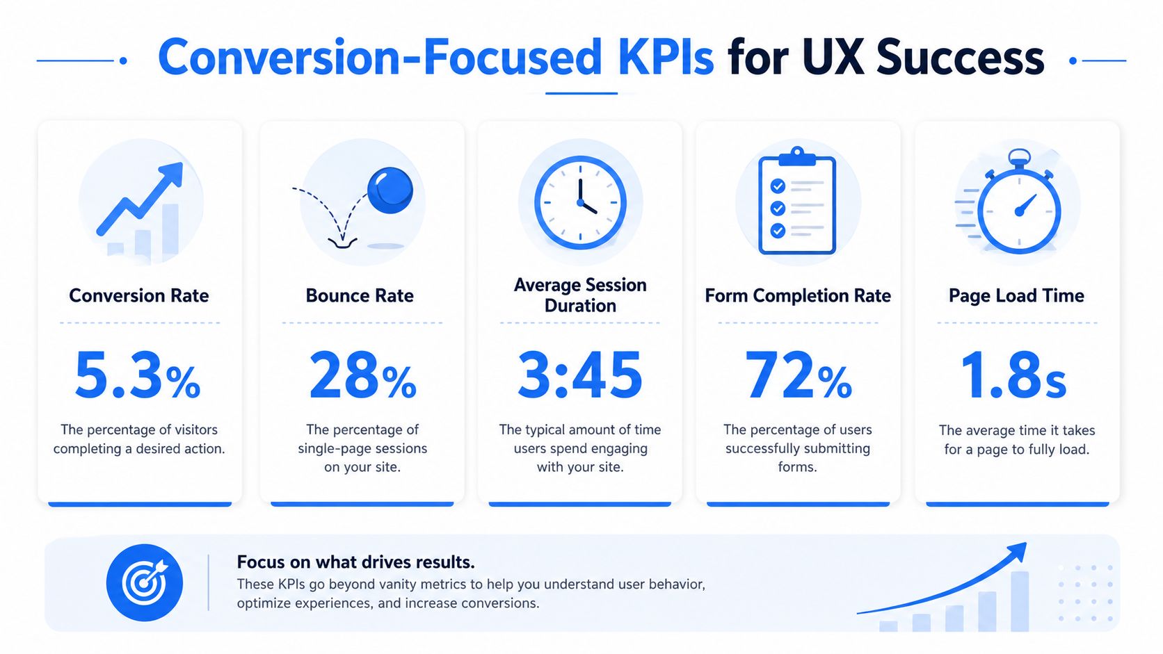
Track lead actions that reflect buying intent
Time on site and pages viewed can help with diagnosis, but they are weak success metrics for a local service business. A visitor who gets the phone number fast and calls may spend less time on the site than someone who browses three pages and leaves.
Use KPIs that match the actions real customers take when they are ready to hire:
- Click-to-call taps from mobile visitors
- Contact form submissions from service and city pages
- Appointment requests from booking pages
- Driving direction requests from your Google Business Profile
- Thank-you page views after a completed inquiry
- Call tracking outcomes such as qualified lead calls versus wrong-number or spam calls
Local search journeys are rarely neat. One person fills out a form. Another calls from the sticky header. Another checks reviews on your Google Business Profile, returns later, and books. Good UX measurement, therefore, accounts for those different paths.
Match the KPI to the journey
Use completion rate for flows with a clear finish line, such as a patient intake form or an appointment scheduler. Use success rate when the visitor has more than one valid way to convert.
That distinction keeps you from misreading the data. If form submissions dip after a page update, the change did not necessarily fail. If click-to-call taps and booked calls went up, the page may be doing a better job getting high-intent visitors to act faster.
Here is a simple way to frame it:
| KPI type | Best use on a local service site |
|---|---|
| Completion rate | Fixed booking, intake, or estimate request flows |
| Success rate | Pages where calls, forms, and direction requests can all count as wins |
| User flow | Finding where visitors abandon the path before reaching a contact action |
| Interaction rate | Checking whether important buttons, tabs, and trust elements get used |
Review results after each meaningful change
Check performance after each UX update with GA4, call tracking, booking software, and Google Business Profile insights. Keep the test clean. If you rewrite the hero, shorten the form, add financing text, and move the call button in the same week, attribution gets muddy.
I usually want owners to answer three questions after any change:
- Did more visitors reach a contact action?
- Did lead quality improve?
- Did the business book more of the right jobs or appointments?
Those questions keep attention on revenue, not vanity metrics.
If a site change cannot be tied to calls, qualified leads, or booked appointments, it has not been measured well enough.
For a tighter way to connect local visibility, website actions, and actual lead outcomes, use this guide on how to measure marketing effectiveness.
An Actionable Playbook for Prioritizing UX Fixes
A homeowner searches "roof leak repair near me" during a storm, taps your Google Business Profile, lands on your site, and cannot find the call button without scrolling. A new patient does the same on a dentist site, sees a long wall of text, and backs out to the next option in Maps. That is the priority test. Fix the points where ready-to-book visitors get stuck before they call or request an appointment.
Owners usually stall because the site has ten visible problems and only enough time or budget to fix two. The practical way through it is simple. Rank every issue by business impact, effort, and how close the page sits to revenue.
Use an impact and effort filter
Start with one page that already attracts high-intent traffic. In local service businesses, that is usually the homepage, a top service page, a city page that ranks well, or the page linked from your Google Business Profile.
Then sort fixes into four buckets.
| Impact and effort | What to do |
|---|---|
| High impact, low effort | Fix first |
| High impact, high effort | Schedule after the quick wins |
| Low impact, low effort | Handle during routine updates |
| Low impact, high effort | Leave alone unless a bigger problem depends on it |
Good first moves are rarely fancy. Put the phone number and primary CTA higher on mobile. Cut form fields that office staff do not need. Replace vague button text like "Learn More" with "Book an Appointment" or "Request an Estimate." Add trust signals near the contact action, not buried in the footer.
Those changes matter because they shorten the path from search to contact.
Run one clean improvement cycle at a time
A lot of local sites get worse because too many changes go live at once. The owner updates the headline, swaps the layout, adds a chatbot, changes the form, and then has no idea which change helped or hurt.
Use a tighter process:
Name the friction clearly
Example: visitors from mobile search reach the service page but very few tap to call.Write a plain-English hypothesis
Example: a sticky mobile call button and a shorter intro will get more phone calls.Change one meaningful element
Keep the rest of the page stable so the result is easier to read.Watch the right actions
Check calls, form starts, booked appointments, and drop-off points on that page.Decide fast
Keep the change, revise it, or roll it back.
This also helps settle internal debates. Staff opinions matter, but they should not outrank evidence from actual customers trying to book.
Start with pages closest to revenue
A roofer should fix the storm damage page before the gallery page. A dentist should fix the new patient or emergency dentist page before the blog archive. A plumber should fix the water heater page before the company history page.
The right order usually looks like this:
- First, fix pages targeting transactional searches such as "roofer near me," "emergency dentist near me," or "water heater repair near me"
- Next, improve the page people hit from your Google Business Profile
- Then, clean up the support pages that build trust, answer objections, and help people contact you later
That order matches how local buyers behave. They find you in search or Maps, scan fast, look for proof, and decide whether to call. UX work should follow that same path.
A simple scoring method keeps teams honest
If you want a fast way to choose between fixes, give each issue a score from 1 to 3 in three categories:
- Revenue proximity: how directly the page supports calls or bookings
- Friction severity: how much the issue blocks action
- Implementation effort: how hard it is to fix
A sticky call button on a high-traffic service page might score high on revenue proximity and friction severity, with low effort. That goes first. Rebuilding a low-traffic testimonial page might score low on revenue proximity and high on effort. That waits.
The goal is not a prettier site. The goal is fewer lost leads between the "near me" search and the booked job.
If you want help turning local searches into booked jobs and patient appointments, Transactional LLC can help you tighten the full path from Google Maps and transactional search terms to high-converting landing pages and clearer lead tracking.