


A service business owner can check Google Maps from the front door and see a strong Map Pack result, then drive across town and discover that the same listing has effectively disappeared. The phone still works, the office hasn't moved, and the profile hasn't changed. What changed was the searcher's location.
That's why Google Maps heat maps matter for local SEO. They turn scattered ranking checks into a geographic view of where a business appears for high-intent searches such as “roofer near me,” “dentist near me,” “air conditioning repair near me,” and “plumber near me.” For Transactional Marketing, those transactional search terms are the priority because the person searching usually has a problem to solve and is ready to contact a provider.
A heat map doesn't replace call tracking, conversion data, or sound local SEO judgment. It adds the missing location context, helping an HVAC company, roofing contractor, dental practice, or pest control business decide which neighborhoods deserve content, reviews, service-area attention, and budget.
When Your Map Listing Disappears Two Miles Away
The owner of an HVAC company sat in a parking lot near the business address and searched for air conditioning repair near me. The profile appeared prominently in the Map Pack. A few minutes later, the owner drove across town, searched again, and watched the listing fall out of view while unfamiliar competitors occupied the top three positions.
Nothing about the business had changed during that drive. The searcher's location had.
That visibility cliff is the problem a local SEO heat map diagnoses. Instead of relying on one search from the office, an operator plots a grid around the target market and checks the selected keyword from each point. The resulting colors show where the profile performs well, where it weakens, and where a customer may never encounter it.
A single address-based ranking check can create false confidence. A roofing company may dominate searches near its office while remaining weak in the suburbs where storm-related demand is strongest. A dental practice may rank well around one branch but lose visibility between locations. A service-area business needs to understand its actual coverage, not just its performance at the verified address.
Operator's rule: If the report only shows one pin and one ranking, it isn't showing the market. It's showing one search moment.
The visibility boundary matters
The practical value of the grid is its boundary. A green cluster near the center suggests that the business is competitive in that area. Yellow cells indicate weaker visibility, while red or cold cells show locations where the listing is buried or absent from the measured result set.
That boundary changes decisions. It can reveal that a business should target one suburb before expanding into a distant city, or that a landing page should address a nearby neighborhood where the company already has operational capacity. It can also expose wasted effort, such as promoting a broad service radius when the profile has little visibility or route value at the edge.
Businesses trying to understand why a business isn't showing up on Google Maps should start by measuring several customer locations instead of assuming the address tells the whole story.
What Google Maps Heat Maps Actually Are
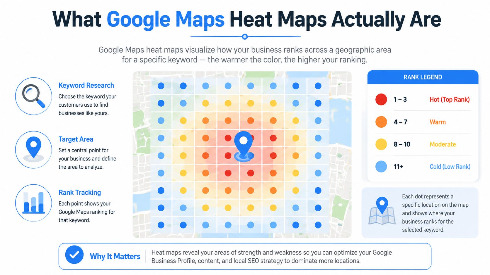
For local SEO, a Google Maps heat map is a grid overlay around a target location. Each grid point runs a chosen keyword search, records the business's position in the local results, and converts that position into a color. The purpose is simple: make geographic ranking differences visible.
A typical SEO grid might use green for top Map Pack visibility, yellow for weaker but measurable placement, and red for results where the business is effectively invisible. The exact palette varies by platform, so the legend matters more than the color itself. Greener cells generally mean the business is closer to the top three local results, while redder cells indicate that the listing needs attention or isn't appearing prominently.
Don't confuse three different map visuals
Google's own mapping documentation defines a heatmap as a visualization of data intensity at geographic points. Its mapping and Looker Studio guidance describes a color gradient in which values concentrate around points and decay with distance, making density patterns easier to interpret (Google's Maps JavaScript heatmap documentation).
That technical concept also appears in the consumer Location History experience. Visited places show with warmer colors when visits are more frequent and cooler colors when they're less frequent. Users can export Location History through Google Takeout and use a visualizer to create a consolidated map of movements, a workflow discussed in this overview of Google Maps Location History heat maps.
An SEO heat map is different. It doesn't show where people traveled or where search interest is concentrated. It shows how a business listing ranks from different geographic coordinates. It's usually produced by an SEO platform using rank checks from a grid, rather than being a native consumer feature inside Google Maps.
Radius changes the business question
A one-mile grid around a neighborhood roofer answers a local visibility question. A broader grid around a multi-location dental group answers a market coverage question. If the radius is too small, the report may hide important suburban gaps. If it's too broad, distant cells may add noise that doesn't reflect realistic travel patterns.
The useful radius follows the service area and customer behavior, not an arbitrary city boundary. That distinction keeps the map connected to calls, appointments, estimates, and booked jobs.
How Google Builds the Rankings That Heat Maps Reveal
Google says local results are primarily shaped by relevance, distance, and prominence. The company also explains that prominence can be influenced by factors such as links from other websites and the number of reviews a business has, while more reviews and positive ratings can help local ranking (Google's explanation of local ranking).
A grid displays the combined effect of those factors, not one isolated score. Distance often creates the most obvious visual pattern. As the search point moves away from the business location, the listing may shift from strong visibility to weaker visibility. The pattern can look like a fading ring, but it won't always be perfectly circular.
Relevance determines whether the profile and website match the query. An HVAC company that clearly supports air conditioning repair may produce a different map from the same company when the query changes to commercial refrigeration. The address stays fixed, but the relationship between the business, category, service, and search intent changes.
Prominence bends the pattern. Reviews, local references, links, and brand familiarity can help a business remain competitive in some directions while competitors dominate others. Two businesses with nearby addresses can therefore produce very different color fields for the same keyword.
Reading the pattern instead of chasing the color
| Ranking Factor | What It Measures | Heat Map Signature | Example Pattern |
|---|---|---|---|
| Relevance | How well the business matches the query and service intent | Strong or weak visibility across many cells | A profile optimized for HVAC repair performs better for repair terms than unrelated service searches |
| Distance | How close the searcher is to the business | Visibility often fades as points move outward | Green cells near the address transition into weaker cells across the service area |
| Prominence | The business's authority and recognition in local results | Rings become uneven or extend farther in some directions | Strong local signals help the listing hold visibility where competitors are less established |
The map is most useful when the operator asks why a band changes. A weak outer area may need stronger local relevance, more prominence, a better service-area strategy, or a more realistic expectation about where the business can compete.
For a deeper breakdown of these signals, Transactional Marketing also covers Google Maps ranking factors in practical local SEO terms.
Setting Up a Google Maps Heat Map the Right Way
A useful grid begins with the right center point. For a single-location business, use the verified business address. For a multi-location operator, build the analysis around each office or around the geographic center of the primary service area, depending on the decision the report needs to support.
Radius comes next. A plumber serving a broad ring needs enough spacing to reveal neighborhood differences without creating a map so dense that adjacent points become difficult to interpret. An HVAC company operating in a compact metro can use tighter spacing because customers may cross several neighborhoods within a normal service route.
Build the scan around transactional intent
Keyword selection determines whether the map helps the business make money or merely produces attractive colors. Start with terms that show buying intent:
- Core service terms: Use searches such as air conditioning repair near me, roofer near me, or dentist near me when those services match the business.
- Emergency and urgent terms: Separate emergency plumber or same-day repair intent from informational queries.
- Neighborhood terms: Add suburb and ZIP-level phrases when customers commonly identify their location.
- Service variations: Keep residential, commercial, replacement, repair, and maintenance terms in separate groups when the business serves different audiences.
The keyword list should reflect actual demand and conversion paths. Vanity queries can make a report look busy while telling the owner little about calls or booked work.
Match the grid to the operating area
| Business Type | Grid Radius | Point Spacing | Keyword Count |
|---|---|---|---|
| Local HVAC company | Compact service territory | Tight spacing in dense neighborhoods | Focused transactional service set |
| Plumbing contractor | Broader route-based area | Wider spacing that reflects realistic travel | Separate emergency and standard service terms |
| Roofing company | Suburb and storm-work coverage | Neighborhood-level spacing | Core roofing and location-intent terms |
| Multi-location dental group | Office-centered coverage | Consistent spacing around each branch | Separate treatment and office-area groups |
Tools such as Local Falcon, BrightLocal, and GeoGrid can automate coordinate-based rank checks and present the results as color-coded grids. The platform matters less than the setup. A grid shaped around city limits may mislead a service business whose customers come from only a few practical travel corridors.
Export the raw data and a visual snapshot. The CSV supports analysis, while an annotated PNG gives the owner, content writer, and Google Business Profile specialist the same reference point. Businesses can also use Google Business Profile setup guidance to make sure the profile foundation is sound before interpreting weak cells as a content problem.
What a Heat Map Looks Like for Two Different Service Businesses
A single-location roofer and a multi-location dental group can produce equally colorful reports and require completely different strategies.
The roofer has one verified address in a mid-sized city. The strongest cells sit near the depot, while visibility weakens across the surrounding suburbs. The owner's first instinct might be to expand the service radius everywhere, but the grid shows a more useful question: which outer neighborhoods have enough operational value to justify focused investment?
The roofer's map points toward market selection
If storm work, inspections, and replacement projects cluster in particular suburbs, those areas deserve closer attention. The operator can compare the weak cells with route economics, existing customers, and the company's ability to dispatch crews efficiently.
The next actions may include:
- Suburb-specific service pages: Build useful pages that explain roofing services in the target area, rather than duplicating the city name across thin pages.
- Local proof: Encourage legitimate reviews from customers in the neighborhoods the business wants to serve.
- Profile alignment: Make the Google Business Profile accurately reflect the services the company performs.
- Selective expansion: Test one service area or neighborhood at a time instead of treating the entire metro as equally valuable.
The grid doesn't prove that a suburb will produce profitable jobs. It shows where visibility is weak, so the owner can combine ranking data with capacity and revenue judgment.
The dental group needs gap coverage
A four-location dental group has a different pattern. Each office creates its own strong area, but a cold pocket appears between branches. Expanding the overall radius may not solve that gap because the problem isn't necessarily distance from every office. It may be weak geographic relevance, insufficient local content, or a lack of clear internal linking to the office that could serve those patients.
The group might create a location-focused landing page for the underserved neighborhood, connect it to the appropriate office page, and publish useful treatment content tied to that area. The strategy is to close a specific gap, not to make every branch compete for every search.
The same color, red, can therefore mean two different things. For the roofer, it may identify an expansion decision. For the dental group, it may identify a content and internal-linking decision.
Turning Heat Map Insights Into GMB and Keyword Action
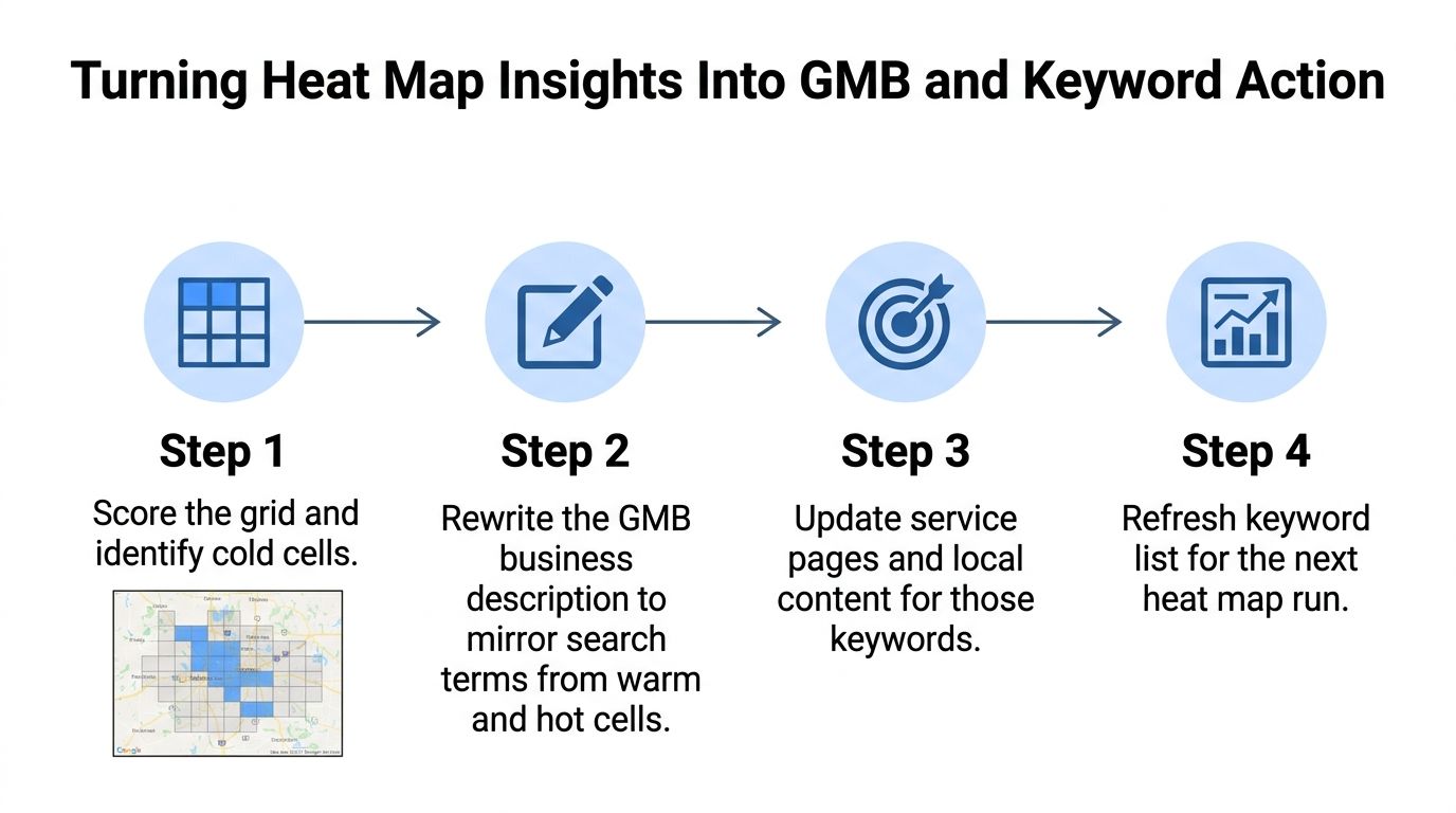
A cold cell becomes useful only when someone assigns it a task. The task may involve the Google Business Profile, the website, reviews, citations, or the keyword set itself.
Start with the profile. Compare the searches producing stronger cells with the language used in the business description, services, categories, photos, and posts. The profile shouldn't be stuffed with locations or awkward phrases, but it should clearly communicate the services and areas the business supports.
Turn cells into a content system
An AI-optimized content silo can help organize the work without replacing editorial judgment. Use one strong page for a meaningful service-area cluster, then support it with articles that answer specific neighborhood and service questions. The content should make the business easier for both traditional search systems and large language models to understand, especially when the company's services, locations, and customer problems are stated clearly.
A practical workflow looks like this:
- Score the grid: Mark weak areas for each transactional keyword group.
- Prioritize the opportunity: Choose neighborhoods that fit service capacity and commercial value.
- Build supporting relevance: Improve the appropriate profile fields, location pages, internal links, and useful local content.
- Recheck the same coordinates: Compare the new scan with the original baseline instead of changing the grid every time.
A query such as emergency plumber Clintonville is more actionable than plumbing tips because it describes a customer closer to contacting a provider. Transactional Marketing focuses on these high-intent searches, including roofer near me, dentist near me, and air conditioning repair near me, then connects the map work to location-specific content.
Businesses researching local keyword research can use the same intent-first approach to keep their tracking set focused.
The next scan should answer a business question, not merely produce a fresh screenshot. Did the target neighborhood become more competitive for the selected service? Did the profile change coincide with better visibility? Did the content target a real customer need, or did it add another generic location page?
Why Heat Maps Belong in a Weekly Reporting Loop
A one-time heat map is an audit. A recurring heat map is an operating signal.
Local visibility can shift when competitors improve their profiles, earn reviews, publish stronger content, or change their service focus. Google can also adjust how it evaluates local results. A report that looked healthy several weeks ago may no longer describe what nearby customers see.
Use the grid as an early warning system
A weekly scan doesn't mean the team should react emotionally to every color change. It means the team can identify movement early, investigate whether the change is consistent, and connect it to a deliberate action.
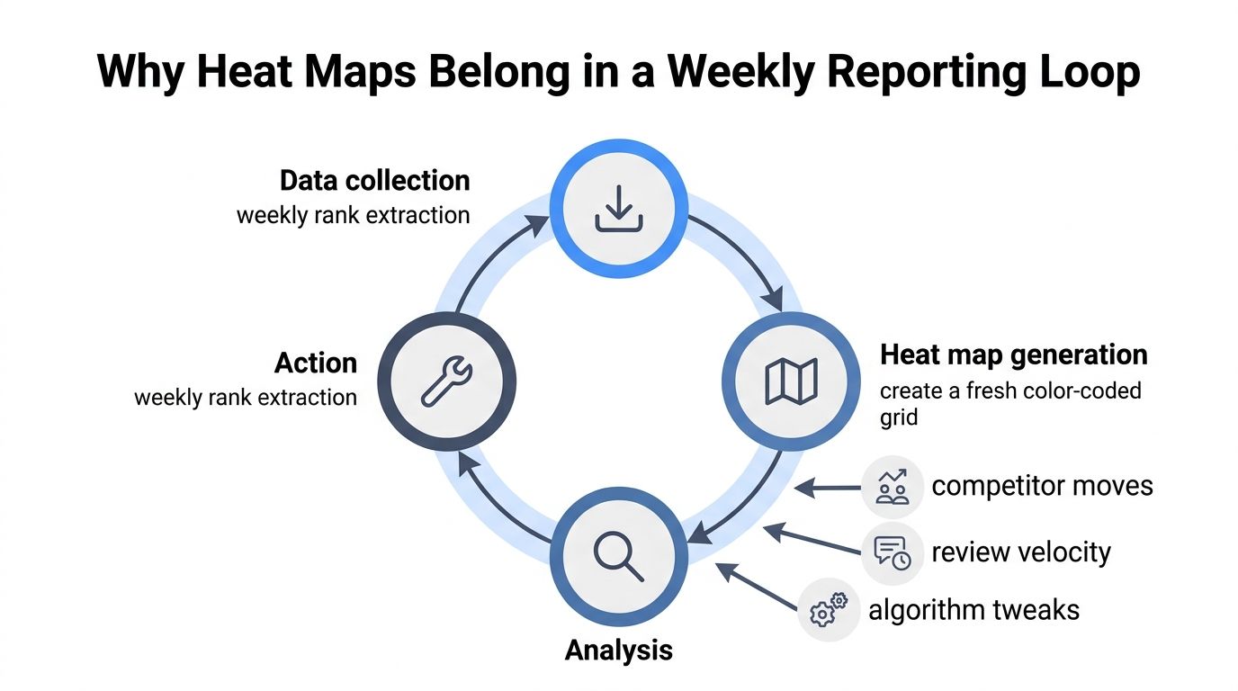
The operating loop is straightforward:
- Collect the same data: Keep the keyword groups, coordinate pattern, and measurement settings consistent enough to support comparison.
- Compare the snapshot: Look for cells that moved from strong to weak, or weak to strong, rather than judging the new image alone.
- Investigate the cause: Check competitor changes, review activity, profile edits, service-page updates, and technical issues.
- Assign one response: Select a focused action such as a legitimate review request process, a profile update, or a local content improvement.
A 30 to 60 day decision loop gives the team enough time to connect optimization work with ranking movement without treating every short-term fluctuation as a victory or failure. Weekly scans provide the observations, while monthly strategy reviews decide which neighborhoods should be promoted, paused, or removed from active targeting.
Reporting principle: Show the change between snapshots, not just the latest rainbow of colors.
Store the scans so the team can view trends by service, city, and neighborhood. A dashboard that combines keyword timelines, map visibility, Search Console queries, and traffic gives the owner more context than a heat map by itself. The map identifies the geographic problem. Calls, booked jobs, and patient inquiries determine whether the response was commercially useful.
For HVAC operators building the wider marketing system around local demand, a resource on master HVAC company marketing can add industry-specific context to the map and content decisions.
From Color-Coded Grid to Top Three Map Results
The business outcome isn't a beautiful grid. It's stronger visibility for transactional searches that lead to calls, estimates, appointments, and booked jobs.
A yellow cell is a decision signal. It may indicate that the business is visible but not consistently competitive for a valuable query. The remedy could involve improving service relevance, strengthening the location page, earning legitimate local mentions, or building a better review process. A green cell deserves protection, because competitors can challenge it through their own profile work and local signals.
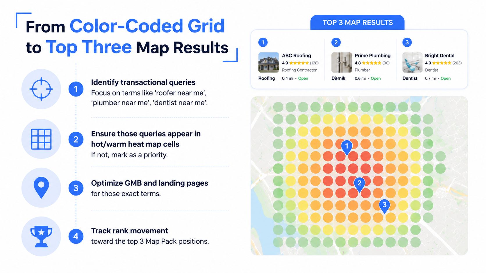
The top three Map Pack positions are especially important to businesses targeting searches such as “roofer near me,” “plumber near me,” “dentist near me,” and “air conditioning repair near me.” Transactional Marketing is built around those searches, where a customer is looking for a provider rather than general education.
Apply a focused optimization cycle
Use the map to avoid broad, unfocused marketing:
- Identify the weakest valuable cell: Choose the location tied to a service keyword with genuine commercial intent.
- Assign one tactic: Select a profile, content, review, citation, or internal-linking improvement that matches the diagnosed gap.
- Re-scan the same point: Keep the comparison clean so the team can tell whether visibility changed.
- Connect the result to leads: Check calls, forms, appointments, estimates, and booked work before scaling the tactic.
Google's documentation treats heatmaps as density layers that can be updated dynamically, and mobile utilities render them through tile overlays at different zoom levels (Google's Android heatmap utility guidance). That technical detail reinforces a practical lesson: the visual depends on the underlying data, radius, spacing, and rendering choices. A map can look impressive and still mislead the owner if the grid doesn't represent the actual service area.
Transactional Marketing uses map-ranking heat maps as part of a broader local SEO workflow that targets specific cities and high-intent terms. The company's stated approach also includes Google Maps optimization, GMB setup, AI-driven content planning, website work, and reporting tied to search visibility.
The next step is simple. Find the weakest commercially important cell, make one evidence-based improvement, and measure the same query from the same location before expanding the campaign.
Transactional LLC helps service businesses improve Google Maps visibility, target transactional searches, and connect heat-map findings to GMB optimization and AI-focused local content. Visit Transactional LLC to discuss a service-area strategy for your HVAC, plumbing, roofing, dental, pest control, or other local business.